-
Architects: xyz architects
- Area: 450 m²
- Year: 2017
-
Photographs:mina
-
Manufacturers: Breezway, Daikin, Dulux, Escenium HAUS, Kohler, Legrand / Bticino, Megaman, Porcelanosa Grupo, Quan Dat, Teka, VALVO
-
Lead Architect: Dao Quoc Viet
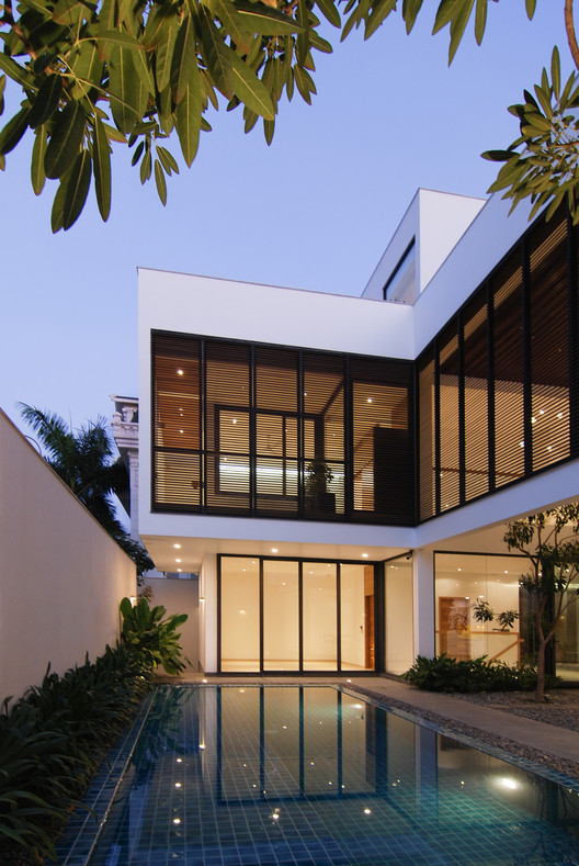
Text description provided by the architects. Avoiding social interaction yet allowed wide possibilities of contact with nature is the core aim of this project. The owners wanted to keep the house as the private meeting hub for the big family, rather than for hospitality purpose. There was no hunger of connection with the neighborhood.
The architects resolved this assignment with the close-outside-open-inside concept, by concealing itself from the outside, and open the most inside to welcome natural lighting and natural ventilation.
The house is composed of 3 floors. Open ground floor where connects living room, dining room and library. First floor with 3 bedrooms which are connected by a transitional space for some entertainment activities before sleeping time.All the closed spaces were positioned a bit further, leave the center very open.
The Architects’ intention was to borrow the greenery of the outside garden to extend the interior view.
A staircase leads from the ground floor to the second floor, then right straight to the void considered as the inside garden, which is the main hub to draw sunlight in. The bedrooms are positioned around this void, thus naturally making it the center of the whole house.
The entrance leading to the open space of living room brings the view directly to the pool. This somehow blurs the boundary of inside and outside
Natural lighting is the main element to connect all spaces and create a virtual relationship between floors. Openable sliding windows and timber screens allow natural lighting, raining and ventilation through spaces inside.
The master bedroom is located in the second floor of the house. The architects put the inside balcony in front of the large bedroom with the intention of turning it into an inside yard, with a series of timber screen. The owners would able to adjust their placement to meet their need of lighting and privacy.
Getting back to the basic: Simplicity, clean lines, raw material are all to make this project appealing.
The choices of materials were based on the basic materials, such as rough stone, timber and plain porcelain. The raw textures contrasts nicely with the clean look of interiors.